Wednesday, May 29, 2013

Photos from Fanime

This past weekend, we headed over to Clockwork Alchemy, which is a Steampunk convention. It is part of Fanime -- one of the largest anime conventions on the West Coast.

This year, both conventions totaled about 20,000 people (give or take). And we had an absolute blast! We checked in at Clockwork Alchemy, which helped avoided all of the humungous lines at the Fanime portion of the convention. There were a ton of interesting panels from costuming & prop building to in-depth discussions about books, tvs, movies, and panels on how to make things better for everyone. There was also a ton of events, from swing dancing to masquerades, to music concerts.

And lets not forget the sheer number of costumed folks running around both conventions. The amount of cosplayers at Fanime is just staggering. And along with the cosplayers are a fair number of amateur photographers as well.

It reminds me of the various photographers in Venice, Italy during Carnivale. This year, I decided to costume comfortably so I could bring my camera gear with me just so I could take photos.

There are folks who REALLY do an amazing job recreating their chosen fandoms. Some bear a remarkable resemblance to their chosen counterparts. This particular Loki has a very strong resemblance to Tom Hiddleston from the Avengers.


There was some old school cosplayers, too, like this "Hunter Rose" from the old Comico series, Grendel,(which if you haven't read, is just AWESOME!) I intend to coslay Christine Sparr one of these days.

And, of course, there's the amazing set of Star Wars bounty hunters walking around.

Some costumes are rather complex and require a lot of extra helping hands to get fitted.

But the end result is just amazing!

Some costumers were rather "simple", but very well executed.

And other costumes that were understated, yet elegant.


There was a whole slew of anime/manga characters that I didn't recognize, but they looked awesome!

Some, like this Deadpool maid, were just running around having fun. She(?) had a whole crew of various Deadpool cosplayers in various other outfits.

And, lets not forget that many of the cosplayers had some pretty amazing props. 


Of course, cosplayers don't just limit themselves to anime, manga/comic books, or video games. This Snake Plissken, from Escape from New York, is pretty darn good.

And not all of the characters are humanoid in appearance. There were a few fully furred cosplayers there as well. This one walked on all four legs (very convincingly too!)


Unfortunately, because there were a ton of people, it was hard to get some photos that really showcased off the costumes.


Although, sometimes, I could get lucky, and get a few images isolated from the general crowd with lighting and DoF.

Or an isolated background. (If there was one available and nearby!)

And some were outside, so the backgrounds were a little bit better.


It didn't matter who you were, what you looked like, or how you moved around, there were a ton of folks who just loved their fandom enough to want to cosplay it. And I think it was awesome.


We'll definitely be back at Fanime next year, just like the last.

Tuesday, May 28, 2013

WIP: Intermediary Post


While I get my Fanime/Clockwork report and photos written up, here's an intermediary post outlining some of my Works in Progress.

My Denver Cowl using Miss Babs yarn, "Copper City". This pattern is pretty simple and easy to memorize, so this WIP is my knitting when I don't need to pay attention.

This is one of the cables from my Aran sweater by Alice Starmore, St. Brigid. Unlike the cowl, I do need to pay very strict attention to this particular pattern.
Thursday, May 23, 2013

How to Take Better Photos - Lighting for Texture

This post is part of the "How to Take Better Photos" series of this blog. In this post, I'll discuss lighting for texture.


Your fibercrafted items, whether it be handspun yarns or items that have been knitted, crocheted, or woven, have texture and details. When taking photos of your product, you want to show off these textures and details to your audience.

In a previous post, I wrote about the qualities of different types of light. However, in addition to light, shadows (and the subsequent highlights) are also an important element of defining texture in photography. Without shadows & highlights to act as a contrast, you cannot see detail and texture. Shadows are just as important to photography as light.

By angling your light in different directions, you can produce the necessary shadows to show off texture and detail. The direction of your light determines where the shadows fall, and how much of appears in the final photograph. (The same principles also apply to portrait photography.)

If you remember from your high school physics class, light bounces. Light bounces at the same angle it strikes the surface(1). Remember this fact, as I discuss lighting from different directions and angles to help show off your work.

Front Lighting

I'm sure many of you have taken a photo with your on-camera flash and the photos have a flat and washed-out look, or where your subjects have that deer-in-the-headlights look.

Most on-camera flashes provide straight-on, front lighting to a given subject. This type of direct light literally washes away any shadow that might provide any texture or detail, which results in that flat and washed out look characteristic of photos using a direct front flash.

Direct light (much like the sun at noon) have harsh shadows that move in the same direction as the light. The shadows are behind the subject, so any and all details are lost to the camera.


Side Lighting

In contrast, when you take photos with the light at one side or another, this is known as side lighting. It emphasizes texture and shape, which is important when you want to show off your handmade goods, like yarn, knitted/crocheted garments, etc.

The camera is able to pick up on the shadows and highlights produced by the angle-to-subject ratio.


I often use a lot of side lighting at home, where the light is coming off to one side (via a sliding glass door or other light source). You can do this at home as well, if you find a large window where light is streaming through it. Position your subject (and yourself) with the light coming from the side.

  Dr. Who Pendant 

In both of these photos, the shadows provide enough depth and detail that you can see the texture of both the pendant and the linen stitch.
Pretty Twisted

Back Lighting

In addition to side lighting, there is back lighting where the light is behind the subject, shining at the camera. 

The advantages of backlighting is that it helps highlight fuzzy projects that have a halo (such as mohair or angora). It can really convey the softness of a particular knitted object. However, backlighting should not be your only source of light for your photograph of your handmade items. If it were, you'll only get dark shadows, like this photo below. (2)


You can also backlight a subject by either placing the light source to the back and side. A large window with a lot of sun streaming through it can act as both a side and back light. You can also go outside in the sunlight and position your subject accordingly.

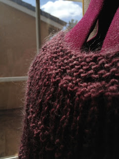
As a note of caution, backlighting can cause some problems with getting the correct exposure. You need to ensure that your exposure is set on the subject and not the backlight.  For instance, in this photograph, I'm using the window light as a side and backlight. The rightmost part of the image is overexposed but you can see some of the fuzziness of the yarn being photographed.


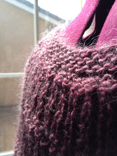
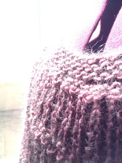
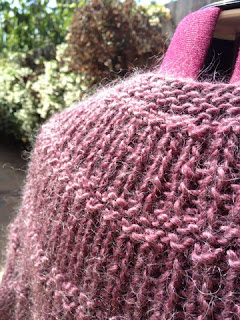
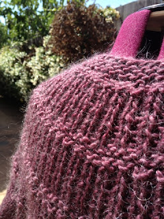
You'll have to play with the exposure with backlit objects in order to get it correct. In the following three (straight-from-the-camera) photos, I have the light coming from the side from a glass window, which provides backlighting and some sidelighting. You'll notice that I've played with the exposure settings to try to get a balance of the fuzziness with good side lighting, but each one of these have their own set of problems.

  1. The exposure works for the sky and clouds in the background, but might be slightly too dark to show off the sweater very well, although you do get to see some of mohair halo.
  2. The sky & clouds are over exposed, but I get more of the halo of the sweater and bit more light
  3. Everything in this photo is overexposed. You definitely see all of the halo of the mohair, but there's no detail in the background anymore.

1)   2) 3) 


So, how do you fix the exposure? In the case above, I simply did not have enough light in the front area to take a properly exposed photo. Moving the sweater outside solved THAT problem, because I am able to get more light in general. (But, I still needed to play with the exposure settings even outside.)


Another solution is to use two separate light sources -- your main light source off to the side and a secondary (and weaker) light source behind the subject. (This is an example of cross lighting). In the above outside photo, the sun was acting as my backlight and sidelight because light is bouncing off everything,


However, I won't get too much into cross-lighting in this post, because I think I've probably filled your brains with too much information. I'll talk about cross lighting at a later time.


If you really want to get more lesson about light & photography, I HIGHLY suggest this book, Light: Science and Magic: An Introduction to Photographic Lighting

If you would like to see some of my photography work, please take a look at my Photography website - WyldFire Studios.

Questions?
Let me know. I'd be happy to help you answer any you might have.


Footnotes:
(1) Different surfaces, such as reflective or translucent surfaces (glass/water), will cause light to bounce differently. So, the angle of reflection is relative to the surface from which it bounces. But, for the purposes of this post, we're dealing with matte surfaces.
(2) There are reasons to do backlit only photos, but product photos are not necessarily a good candidates for it!

Monday, May 20, 2013

KnitCompanion App: A Review

While I was working on my Dire Wolf flip-top mittens, my SIL suggested that I try out a knitting app called, KnitCompanion, that would help make reading charts easier. Since I was nearly complete with my mittens when she told me about this app, I opted to just keep on with the paper charts I was using.

(I had even made my own chart holder for it.)

Chart Holder


I had been using the app, Readdle Documents, for PDF patterns, but while did the job for written patterns, it wasn't that great for charts. And, I was planning a very chart-heavy project -- an Aran sweater by Alice Starmore called the St. Brigid --- a pullover that I'm converting to a cardigan. There are FIVE different charts, 7 types of cabling, a variety of row repeats, and two types of increases. Plus, I'm going to be including some waist shaping. All of this together is a lot to keep track!

The back panel, alone, uses a combination of the 5 charts for a total of NINE CHARTS. This is what my work table looked like while I was trying to do some knitting math to work some waist shaping into the pattern (and where in the pattern to include the shaping).


When I tried to test out the my chart holder with just two charts taped together and it didn't work out so well. I could have made the charts smaller, but I actually wanted to be able to read them. I couldn't imagine having to cart around 9 pages of charts taped together, with sticky notes on waist shaping, etc.

So I thought to take my SIL's advice and try out the KnitCompanion app. It took me about 2.5-3 hours to go through all of the tutorials and figure out how to set up my pattern. (CAVEAT: I work in the software industry and am used to dealing with very complicated software.)

BUT, the effort was WORTH it! The ability to just follow the chart, and have the app keep track of everything for you...it's wonderful. I really like this app. I can see it really changing how I deal with patterns with written instructions AND charts.

This is what my worktable looks like now, and the only thing that I need to carry with me.


The GOOD:

The people who designed this were knitters and/or took care to address the needs knitters might have.
  • This app is pretty robust, and keeps track of both written & charted instructions pretty darn well. If you shut your app for any reason, it keeps track of where you left off -- for both row and stitch
  • It allowed me to stitch together 9 charts (row-by-row).
  • You can add highlights to your charts
  • Add your own notes and audio cues.
  • It keeps its own row counters, and you can advance or frog back.
  • It keeps track of what stitch you are on (using a slider.)
  • It won't let me advance to the next row unless I check off that I'd done specific increases that I've set up.
  • It has special counters for shaping, row repeats, repeated stitches, AND keeps track of them for you.  (I have to repeat rows 3-24 multiple times, so this is handy!)
  • You can set it up where the Chart Keys are always visible so you don't have to flip back & forth to different pages.
  • There is a community page on Ravelry where you can look up problems and post requests & ask for help
  • The moderators are quick to answer the questions on the Ravelry boards. (I posted a question/comment, and had a response in less than an hour!)
  • There's an extensive line of very helpful YouTube tutorial videos to help you learn how to use this happ
  • They also have free "Webinars" you can sign up for and learn how to use the app.
  • It has the ability to read any PDF pattern, and you can use your Dropbox to download patterns or through the iTunes interface.

The BAD:

This app isn't perfect by any means.
  • Most people are going to have a very steep learning curve on this app. It does A LOT so consequently, it's a bit complicated. However, the short video tutorials are extremely helpful, and you can figure out most of what you need to do.
  • The UI is not exactly intuitive, so setting up your pattern to read correctly can be a hassle until you get used to how it works.
  • Currently, this app only allows you to sync up with Dropbox. (My other PDF readers allow me to sync up with any cloud storage, including Ravelry.).  However, you can:
    • open up any PDF file that you can access via your web browser .
    • upload patterns to your dropbox
    • add PDF files via the iTunes interface
  • At the time of this writing, the User Guide was slightly out-of-date with the app. But, the developers said they were revamping all of their documentation.
  • This app only reads PDF. If you have paper patterns or patterns in different formats, you need to scan or convert your patterns to PDFs.
  • Some people are going to balk at the price of this app, which is $15.00. BUT, as they say, it's cheaper than a skein of good sock yarn, and you'll find that you're going to probably use it a lot (esp. if you do a lot of chart work!)
  • Currently, this app is only for Apple products -- the iPhone and iPad (regular and the mini). They are investigating into the Android devices, but it might mean they have to completely re-write their code from scratch. Sorry Android users. :-(
Go Try It!

I think the number of good outweighs the bad. Despite it's steep learning curve, I really think this app is WORTH the money. I've managed to get through at least one repeat of the cabling pattern on the Aran sweater and the app has made knitting this pretty simple. (It's almost knitting itself! -- Okay, not quite, but I wish). I don't have to second guess where I am in the pattern; there are no more scribbling of notes or yellow stickies, and I don't have to carry around taped-together pieces of paper that I'm afraid of losing!

You can try download this app for free. They have also included 4 pretty good patterns as part of the download. However, it won't let you open up your own patterns (until you buy it), but first, I highly suggest playing around with their free patterns, go through their tutorials, and learn how to use it. (Don't be like me and try to learn how to use it on a pattern that you want to cast on immediately!)

Now, the app isn't perfect by any means, but it's pretty damn good, especially with all the bells and whistles that the developers keep adding.

Their customer support seems to be very good (which is a must with an app this complicated). My own questions were answered on the Ravelry board within an hour and all of the responses were thoughtful. Plus they're constantly updating their app, and working with knit wear designers to make their PDF patterns more readable.

Check out some of their screenshots from their website to get a better idea of how it handles patterns for both written & charted instructions

(this is from their website)

This app is going to radically change the way I deal with my patterns. I'd say it was definitely worth the money and the effort to learn how to use it.