Monday, April 29, 2013

Gallifrey Necklace

It's not often that I often craft for my particular genres of geek. Sure, I create costumes and such for use at various science fiction conventions, but my general crafting tends to be for every day use.  Just as long as you don't count the Dr. Who Scarf I knitted or the Futurama Brain Slug I crocheted ...or the Dire Wolf Mittens I knitted...

Okay, nix that, I do craft some of my geek...but, back to the topic of this post.

When I was at one of the local sci-fi convention (I can't remember which one),  I saw this pendant from Springtime Creations and I just HAD to have it and make a necklace for myself. And I had the perfect prop for it -- a ceramic Tardis piggy bank...just in case you needed more context.


It's a bronze pendant with Gallifreyan (the Time Lord's language) engraved on it.

It's strung with dark lapis lazuli beads (representing the Time Vortex) and some carnelian (just because I like it and I wanted some additional color). It's about 11" in length.


It's a lovely piece that I wore to Gallifrey One 2013, and that I wear to work on occasion. I've gotten compliments on it from others, who aren't necessarily into Dr. Who fans. I don't even think they knew what it represents.

It's my own little covert form of Dr. Who Geek.

Check out Spring Time Creation's Facebook and webpage. She has a slew of jewelry from dragons to rocket ships to ray guns to Dr. Who pieces. She has Steampunk, science fiction, and fantasy pieces. Her work's pretty awesome, and I proudly own several of her pieces.

(And no, I'm not getting anything for promoting her work, I just really really like her stuff!)

Friday, April 26, 2013

Lady Artisan Apron: Making the Apron (Reprinted Blog Post)

Back in 2007, I wrote this blogpost about making the Lady Artisan Apron. Since then, my website has gone through several iterations, and the article was basically lost. So, a friend recently asked about it, so I thought to try and dig it out and repost it.

So, here is the 1st installment of the three posts in it's original text. I'll post the rest for the next three Fridays.


This costume was inspired by Rachel E. Pollock aka La Bricoleuse who had posted a set of beta intructions for her original version of the Lady's Artisan Apron.

She had original designed it so that she could have a working apron that actually fit a woman's shape. I created my version, not only as a fitted apron, but to fit in with the Steampunk genre. And, I have a fondness for Steampunk

This article contains the nitty gritty of making the apron, and is divided into three major sections:

  • Making the apron
  • Making the Cogs
  • The Finished Apron


June 25, 2007: Making the Apron


I started working on the Lady's Apron (ala Steampunk-ish, Victoriana). I was going to take a break from sewing, but somehow, I got into this strong desire to actually MAKE this damn thing.

I finished the mockup in just under an hour using labricoleuse's instructions, and it worked out pretty darn well. The skirt portion worked out so well that I am going to make a full walking skirt using the same pattern. I had to quasi-guess the bodice measurements, but luckily, it worked out relatively well with only a few minor adjustments.

Fabric Choice

The fabric is brown denim with light beige pinstripes. It's a lighter than Levi-jean denim, but nothing that needed interfacing. I had just enough to make the outfit. I still have small scraps that I am saving to create various smaller pockets, straps, etc. etc.


However, when I went to lay out the pattern on the fabric I had purchased, it seemed as if I didn't have enough (oh noes!). So, I stopped by several JoAnn stores to see if they had more, but, alas, it had been on clearance and there was no more to be had! When I got home, I tried again, this time by shortening up the hem by about four inches (I had given myself a generous hem), and I definitely did have enough. I managed to fit in the major pattern pieces (five gores for the skirt, four bodice pieces, the straps, and still had 1/3 of a yard left over).

Skirt:

Instead of floor-length, the apron is a bit above the ankles, but longer than mid-calf (to accomodate the lack of fabric. The skirt is a simple 5-gore (panel) skirt. I decided not to line the skirt, because, it's an apron afterall, and I didn't want to putz too much. However, all of the seams are french-seamed, and all edges are serged.

Pockets:


During the process of making the skirt, I decided to add the in-seam slant pockets, instead of the patch pockets that Rachel had made (but that I hadn't added to the original mockup). So I took out my generic pocket pattern (made out of cardboard), made slight modifications, whipped up a quick mockup, ripped apart one of the panels on the big mockup, and tried it out. It worked perfectly the first time around. However, did I have enough material to do the pockets? With so little fabric left, mistakes could not be made.


Luckily, I did, so the front pocket piece were made out of fashion fabric and the back pocket piece out of muslin. The skirt portion was a 5-gore skirt, so I sewed three gores (panels) together, then added the pockets to either side, then attached the remaining two panels. I placed twill tape (because I have a HUGE roll of it) to the pocket sides just to reinforce the fabric where the pockets are located.

The inside pocket flap was attached to the skirt front and will be pressed over so that it's hidden on the inside. Consequently, this piece was made out of muslin.

Afterwards, I attached the "front of pocket" piece to the inside pocket. Then attached the front pocket piece to the next skirt panel.

Patch Pockets:

For the actual apron pockets, I merely made panel pockets out of the remaining fabric. I had to cobble together some smaller pieces to make actual "rectangles" for the panel pockets, but it definitely works. There's a breast pocket for pens, and two panel pockets on the legs using the wrong side of the fabric. I'm considering adding a welt pocket for a pocket watch.

Bodice:
The bodice is made from four pieces (two pattern pieces), that make a heart-shaped front.


I ironed-on stabilizer to the last 1/3 of the bodice (the triangles at the end) just for a bit of stiffness so that when it wrapped around my waist, it would stand up a bit and not flop over.

I attached the bodice to the skirt, and added twill tape to the waistline for just a bit of added strength. After attaching the bodice to the skirt, I lined the bodice just for a bit of finishing with some muslin.

Miscellaneous

I had some extra bits of material that I made 1/2" straps to which I added D-rings, that were then attached to the waist line. I really should have thought of those sooner, so I could have sewn them INTO the waistline when I attached the bodice, but oh, well.

The front has 1" straps from the same material. It's a simple tube that has been pressed. I also made 2" straps for the back belt portion.

Closures: For the back belt portion, I picked up 2" black parachute closures from Joann's. I didn't like the black, so I decided to paint them a burnt gold to match the coloration for the skirt.


The black plastic doesn't coat well, but it does look slightly antiqued, so I wouldn't have to antique it with black paint later.

For the front, I decided that I wanted that "overall" look, so I picked up a set of "overall" closures (again from Joann's), a nd they had a bronze/brass one that fit nicely with the overall theme.

Finished Piece 

The finished piece is rather form fitting, and I do quite like it.


The apron is 90% done. It took me longer than the mockup, since I was futzing with bits and pieces (adding twill tape to the waist line, french seaming everything, adding a really short lining to the bodice top, adding stabilizer to the tail end of the bodice piece., etc, etc, etc.) Now, I just have to actually add pockets and the belt buckle for the back. I should have enough extra fabric pieces for two more pockets, unless I want to make them out of a contrasting fabric.

Next Friday: COGS!!!

Wednesday, April 24, 2013

How to Take Better Photos: Color Balance

In my last photography post, I talked briefly about how light is not all equal, and that different light casts different "colors".  Once you understand to see that, you can easily correct this color cast to show "true" colors (like for product photography) or you can use these color casts to set a "mood" for your photograph.

Your camera has the ability to "balance" out the color casts while you're taking a photo. Most of you probably simply use the "auto white balance" on your camera setting.

This is PERFECTLY okay! I tend to use the Automatic White Balance (AWB) on my own camera about 80% of the time. The following image was taken with AWB. (It's my Hemlock Ring Blanket that I blocked recently.) The color of the yarn is "Oatmeal" (Cascade Eco), and the color in this photo is pretty darn close to reality. I used the late afternoon sun as my source of light.


But, there are times, when the automatic white balance (aka WB) doesn't work.

Simply put, when you take a photo, your camera tries to figure out the overall color of your photo. BUT, sometimes, if there is no white or "neutral" color in the image or if there is a single color dominating the image, then your camera is fooled and you get a photo where the color doesn't match reality.

You can set your camera's WB to a specific color temperature (known as Kelvin -- which is another topic entirely involving lots of numbers and photography geeking, so I won't bore you), or you can try using some of the presets built into your camera. Here are some of the most common icons used in cameras:

(I highly recommend reading your camera's manual to understand how to use these presets.)


Using these Pre-Built Settings


The above icons represent the types of color casts your camera is capable of correcting. Basically, what happens (in simplistic terms) is the following  .....

Your camera assumes that there's a specific color cast (at a specific temperature) and adds the opposite color to balance it out to "white".  So, if there is an "orange" cast for tungsten, it adds "blue" to your image. If there's a green cast, it adds magenta.***

I'm going to go over each of these icons, what they mean, and what your camera is doing for each of them.

(You don't have to use these presets under these specific circumstances. You can use any of these settings to add mood or a different type of lighting to your image. These are just guidelines!)

  1. Daylight --- 
    • Used when? This setting is for when your location is relatively sunny. 
    • What your camera does: Balances this as the sun at midday.
  2. Fluoresent -- 
    • Used when? if you're inside a gymnasium or work that has fluoresent lighting, set your WB to "Flouresent" to get rid of the green cast
    • What your camera does: Adds magenta to balance it out to white.
  3. Tungsten -- 
    • Used when? If you're inside your house and you use incandescent lightbulbs, then set your WB to the lightbulb icon. 
    • What your camera does: Adds blue to balance it out to white.
  4. Shade / Cloudy-- 
    • Used when? These option is an interesting one. Whenever it's a cloudy day or if you're in the shade during a sunny day, there's a bit more "blue" in your image. You can use either of these for the same thing.
    • What your camera does:  Adds a little bit of orange to warm up your image. For "Shade", it adds a bit of extra orange.
  5. Flash  --- 
    • Used when? When you're going to be using your on-camera built-in flash
    • What your camera does: Adds a bit of orange and magenta to balance out the color of your flash.
The following images* shows how each of these presets work and the color the camera** adds.

Color Balance Presets

You can notice the following from the images.

  • The "Fluoresent" & "Tungsten" images are the most obvious color changes. Because I'm using sunlight as my light source, the color changes are very obvious here.
  • The "Daylight" is closest to AWB because I was using sunlight as my main source of light. 
    • For this image, I might actually choose "Daylight" because it's a bit closer to the "Oatmeal" color than the AWB image above -- but they are pretty close to each other. It just becomes a matter of taste.
  • The three options "Shade", "Cloudy", and "Flash" add varying degrees of "warm" orange to your image.

Okay, now what? How Do I use these Presets?

You can probably get away with using AWB or "Daylight" especially, if you're using natural sunlight as your color source. However, if you have mixed lighting in your house (say tungsten and daylight light bulbs in your house), you might run into problems.

These presets can help you fix the color problem. Digital "film" is cheap, and you can easily take a few shots using the different white balance setting on your camera, then compare them to see what you like the best!

  1. First, try AWB and take a photograph.
  2. Look at your preview image. 
  3. Try "Daylight" and compare the two images.
  4. If either looks okay, then continue shooting. Otherwise:
    • If the preview image looks blue-ish or "cool", then try "Shade" or "Cloudy" and take another photograph.
    • If the image too warm, then  try Tungsten 
    • If the image is too yellow or green, then try Fluorescent.
  5. Compare your images.
  6. Choose the best option, and continue shooting.
One of these presets should fix 85-90% of the problems that you might have.  If you still have a problem after trying these steps, try changing your light source for your craft project.

Of course, you can always fix the white balance of your photo is a photography software, like Photoshop or similar, but that means that you have to buy the software and learn how to use it.  Hopefully, you will discover that getting it right in the camera is often times faster.


Questions?
Let me know. I'd be happy to help you answer any questions.


Notes:
* The images are straight out of the camera without any post-processing, but I did resize and put them into a single image for comparison.
** I use a Canon 5D camera. The lens is a 24-70mm lens.
***  If you don't understand why this happens, it's because of Color Theory, specifically the Opponent Process. While you don't need to understand all of color theory, it's good to at least understand the basics, especially if you work with color.

Check out my other blog series on "How To Take Better Photos"

If you would like to see some of my photography work, please take a look at my Photography website - WyldFire Studios.


Tuesday, April 23, 2013

Support Your Local Yarn Stores, Ravelry, and the Knit Designers!

Did you know that you can now buy Ravelry patterns via your LYS?

Imagine this scenario, you're at your LYS (that's "local yarn store" for you non-fiber artists out there) and you see someone's amazing knitted garment. You ask for the pattern, and the LYS shows you the pattern online. Normally, you'd have to wait until you got home to purchase the pattern online (provided that your LYS didn't have a hardcopy in their store).

But now, you also have the option to purchase this pattern from your LYS via Ravelry. The pattern is automatically sent to your email address so you can print it out from home or just use the electronic copy. (And I know my particular LYS is able to print out copies for those folks who just want a paper copy.)

This ability to purchase patterns from Ravelry via your LYS is awesome for a number of reasons:
  1. It allows you to support your LYS and Ravelry at the same time.
  2. It provides you instant gratification in getting that pattern immediately
  3. AND, you can purchase the correct amount of yarn at your LYS and cast on immediately!
It's great for those folks who might not have a Ravelry account, yet, because all you need is an email address in order to purchase the pattern. Or if you don't have a Paypal account (which is required in order to purchase from Ravelry), you can just pay via cash, check or credit card at your LYS.

Honestly, that's a win-win situation for the fiber artists.

And for the LYS, there are a lot of benefits. By being able to offer up electronic patterns, it frees up valuable retail space that they normally would have to keep on file (meaning more floor space for yarn & fiber). AND they can offer a LOT more patterns from different Designers.

Consequently, more Designers can get more exposure AND are able to sell their patterns across different venues. Both the LYS and Designers win in that department too!

For my own LYS, they put all of their paper patterns on sale so that they could free up space in order to have more yarn on sale. Of course, I benefited from their paper pattern sale as well. I picked up a "few" patterns for my own collection (which I'll scan in later to electronic copy....)


Anyways, go out and support your LYS and Ravelry by buying patterns at your LYS! And if they aren't selling patterns from Ravelry, ask them to do so!

Monday, April 22, 2013

Blocking on the Cheap

So I FINALLY got around to blocking the Hemlock Ring Blanket that I started back in 2009 (June 23rd to be precise).

Hemlock Ring Blanket 

 I finished this blanket Dec. 23rd 2012, when I brought it with me on a road trip so as to be forced to work on it, because I only had 3-4 repeats left on the blanket. But even after I finished it, I hadn't blocked it. This blanket was fairly large and I didn't have an area to block it (plus, it was relatively wet weather and I wasn't sure how long it would take to block).


Recently, I bought some mat boards from Amazon so that I could block larger knitted items (especially for my Knit Swirl Coat!) And the weather warmed up considerably. So it was the perfect time to try out my new blocking boards.


These boards were cheaper than getting dedicated blocking boards, as they are used for flooring purposes. The set I purchased was about $15.00. Each board is about 24" x 24", interlock with each other, and you get 6 boards for a total of 288 square feet of blocking room. I figured that this was an adequate enough for my general purpose. (This particular vendor sells sets with a larger number of pieces).

(As a comparison, knitting-specific blocking boards from KnitPicks are about 12" x 12" (~144 square inches), interlock with each other, and you get 9 boards for a total of 108 square feet of room. These boards cost $24.99.)

With my t-pins, these were easy to put together and worked PERFECTLY. I got the grey boards, which heated up pretty darn fast in the warm sun! I had trouble kneeling on them in the 80 deg F weather as they got warm quickly! BUT, on the flip side, it helped dry the wet blanket very quickly. Between the boards and the warm weather, this FOUR FOOT DIAMETER wool blanket dried in under 2 hours!

Four of these boards was enough to block a four-foot diameter blanket. So, I definitely give these a thumbs-up in the usefulness department


The wool blanket blocked out beautifully. It's lovely, huge, and JUST in time for the gorgeous WARM weather that we're currently experiencing. LOL.

However, there is a down-side to using these blocking boards. Because they were meant to be used for flooring, these pieces are rather LARGE. I knew the sizing when I purchased them, but was still surprised when they arrived in the mail. So anyone thinking about getting the larger foam pieces should consider storage space before purchasing them. The knitting-specific blocking boards are about half the size and store easier for anyone who has space considerations.

But, if you're not worried about space and want a cheaper alternative, these work pretty darn well.

Thursday, April 18, 2013

How to take Better Photos --- Seeing Light

Photography is the art of drawing with light. It comes from the Greek words "phot" for light and "graphs" for drawing. So light is extremely important in photography. But not all light is made equal.  This fact is important to note, because it does affect your photography.

Our brains normalize light that our eyes see so most people can't tell the difference in the quality of light. Most people can only tell when it gets dimmer or lighter, or natural light from artificial light. But did you know that light has color and can cast different shades of color?

In order to take good photos, you need to do is to train yourself to see the actual differences in light, especially if you're taking product photos of your handmade products. You want to portray accurate colors!

Once you begin to "see" light and see the color of light, you can make adjustments and take better photos.

Natural Light

Let's go over natural light first. There are a lot of proponents who claim that natural light (aka sunlight) is the best form of lighting. There are also people who claim that chocolate is better than vanilla or strawberry. It comes down to personal taste, choice, and how well you understand light well enough to replicate results you want repeatedly. (There are many photographers who can trick you into thinking their artificial light is sunlight).

Not all sunlight is equal. Sunlight at noon (esp. during the summer) is very harsh, striking very short and very crisp shadows. We've been told to try to stay out of the sun during the high hours of noon because that's when the sun is at its highest peak and the strongest. Because the sun is at its zenith, the harsh shadows come out. (There are photographers who refuse to take photos during the mid-day sun, and often with good reason.)

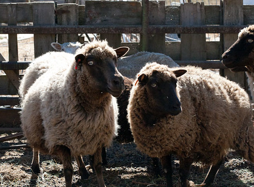
This photo was shot in the bright noon day sun. It's not a bad photo, but you can see that the shadows are rather short (right under the sheep) and they're pretty sharp and crisp. You can see that the sunlight is directly above the sheep (given the glare off of their wool).

Shetland

Whereas the sunlight at dawn and later afternoon (towards the evening) is much softer, and you get long fuzzy shadows.

This photo of my cat, Blue, was taken in the early morning hours. Our room gets a lot of lovely sunlight in the morning, and you can tell that the light is "softer" and not as harsh. In fact, in this photo, you can see a lot of texture in her fur, but not as much for the Shetland sheep above.

Blue in Repose
(I also used a very shallow Depth of Field for this photo.)

The shadows in this photo (taken just before sundown) are elongated and much softer than the one above. The sun is at an angle, and the light is "elongated". You can tell that the sun is coming at an angle due to how the shadows are falling.


Now, interesting enough, the color from the sun "changes" in our perceptions, depending on the time of day, your location on the globe, the season, clouds, haze, etc. It's why you'll sometimes see a pink or orange sky.  The above photo shows a yellowish hue while Blue and the Shetland photos don't.

But generally, you can consider sunlight as having a "blue" cast to it (it's why the sky is blue!)

Artificial Light

Artificial light is an interesting animal. It changes depending on what kind of light bulbs that you have. (YES! It's true!) But our brains and our eyes automatically adjust these hues to "white".

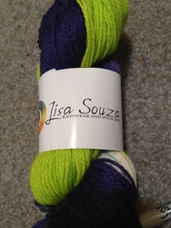
You'll have to learn how to see the cast of light in your home, studio, or wherever you're taking photos, because the type of light might affect the color of your project! (Ever take a photo of your yarn, and the photo of the yarn isn't the same color as the yarn in real life? This is why )
  • Fluourescent lights give off a green tinge,
  • Incandescent (regular) lightbulbs (aka tungsten) give off a yellowish cast. 
  • Daylight bulbs give off a blue cast
  • The flash on your camera will always give a blue cast.
There are other uncommon sources of light, such as vapor lighting that use sodium or mercury that have their own hues, but I digress. If you're taking photos of your handmade items, chances are that you'll use whatever you have around the house, which is most likely going to be fluorescent, incandescent, daylight bulbs, or sunlight.

This photo was taken inside a hotel with predominantly tungsten lighting. You can see the yellowish tinge of the lightbulbs.

The smallest doctor

In addition, you might even be using different type bulbs in the same room, or maybe you'll use a flash when you have tungsten lighting in the room. See this photo below? Sunlight was streaming into the room (from the right) giving a blue cast, but I had the overhead lights on (which are tungsten).

So the left side of the photo has a yellow cast and the left has a blue cast. You can't accurately get a good feel for the colors in this bag, can you? The colors are muddied. It's because of the different and competing light sources. It would be difficult to "fix" this in a photo software, like Photoshop (not impossible, but it would take some work). And frankly, I'm more of a fan of getting it right the first time.

(But as this photo was an "in-progress" photo, I didn't much care about the color cast.)

Semi finished bag

Now, color casts aren't necessarily a "bad" thing. You might want a color cast (like the above photo of the masked person). A color cast can add mood to your photo. But when you're taking a product photo of your handmade items, showing true and accurate colors is going to be your primary goal so ensuring you understand the hows and whys of light casts a color is good to understand.

The Purpose of Seeing Light

As I've mentioned above, the ability to see light allows you to understand what's going on, and thus be able to  modify light to make it better for your purposes (but that will be the topic of another discussion).

Eventually, you can compensate for these color casts in your camera, in a photo software program, or through modifying your light sources OR you can choose to keep the color casts for a specific effect,  but for now, it's good to learn how to see the color of light.

So.... START WATCHING LIGHT!

Since photography is all about light, I highly suggest that you start watching light to get a feel for the different types of light in and around your home or where you want to take photos.

LOOK at the light bulbs in your house. What type of bulbs are you using? Can you see the color being casted?

WATCH how sunlight comes into your house and yard (or wherever you want to take photos). If you want to use sunlight to take photos, then notice the WHEN, WHERE, for HOW LONG the sunlight comes into your house or backyard, and WHAT SEASON you're recording this light   ---- Write these times and locations down. (Trust me. Don't rely on your memory.)
  • Maybe the early morning sun comes in through your living room. 
  • Maybe the afternoon sun hits your backyard porch just right around 4pm and is a wonderful golden glow?
  • Maybe you get a lot of light from 1-3 in your backyard in the Winter, but then it shifts 2-5 in the summer?
In my craft room, the light comes in through a sliding glass door, but I only get the best light between 2-3:30pm (from spring to summer). At that point, the sun moves and my neighbor's house blocks the sun. So I know that I can take some nice sun lit shots during these times and in this location.

Pretty Twisted
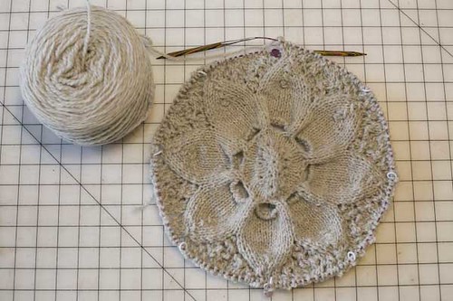
(Notice the slight blue color cast and the shallow depth of field?)

Once you start looking and watching light, you can pick a spot in your home or other location that has good lighting that will make good photographs for your handmade crafted items. You won't have to second guess, and knowing allows you to do some pre-planning.

Next time, I'll discuss how to correct for color casts......


If you really want to get more lesson about light & photography, I HIGHLY suggest this book, Light: Science and Magic: An Introduction to Photographic Lighting

If you would like to see some of my photography work, please take a look at my Photography website - WyldFire Studios.

Questions?
Let me know. I'd be happy to help you answer any questions.

Tuesday, April 16, 2013

Sahlab: A Middle Eastern Drink

I have a particular fondness for warm drinks -- hot tea, hot chocolate, chai, hot toddies, etc. So, when I visited one of my favorite restaurants (Tarboosh) for the very first time, the extremely nice waitresses said I "had" to try this drink.


Which, of course, I did, and it's now a favorite of mine.
It's called "Sahlab" (or Salep), and its found all over the Middle East (Turkey, Lebanon, Egypt, etc) and they all have their own variations (as to be expected.)

The one I tried was a wonderfully thick milk-based drink with finely ground pistachios and cinnamon, then whisked into a wonderful froth!

Technically, Sahlab is made from the starch found in the ground bulb of the orchid, Orchis mascula, and you mix it in with milk (kinda like hot cocoa powder). When I asked the waitress the ingredients, she told me they used milk & cornstarch, so it might be that it's more difficult to get, but I'm going to scour the local Middle Eastern stores to see if they carry it.

I wonder how much of a difference it'll taste betweeen using cornstarch & the sahlab mix?

Upon scouring the web, I found several recipes, but this one appears to be the closest recipe used by the restaurant: TourEgypt.net

Recipe for Sahlab

* 1 1/2 tablespoons Sahlab powder or 2 tablespoons cornstarch
* 4 cups milk
* 3 tablespoons sugar, or to taste
* 2 teaspoons rose or orange-blossom water ( optional )
* 2 tablespoons finely chopped pistachios
* Ground cinnamon

Mix the Sahlab powder or cornstarch with a few tablespoons of milk. Bring the remaining milk to a boil. Pour in the starch mixture, stirring vigorously, so that lumps do not form. Cook over very low heat, stirring continuously, until the milk thickens ( about 10 minutes). Then stir in the sugar and the rose water or orange blossom water, if you so desire.

Serve in cups with the chopped pistachios and cinnamon as garnish. You may also sprinkle grated coconut on top.


The ones I've had do not seem to have rose or orange-blossom water, nor is there coconut. But, since I am fond of coconut, this seems to be a nice optional touch. I'm also going to try this with goat's milk as sometimes cow's milk and I don't get along very well.

Enjoy the drink, and let me know how you like it.

Thursday, April 11, 2013

FO: Reviewing Lisa Souza Yarns & Faceted Rib Pattern

It's been way too long since I actually finished a project, as the Knit Swirl coat is eating nearly all of my knitting time. But I did have an in-between project -- a pair of socks using the Faceted Rib pattern and Lisa Souza's socks.

Untitled

I loved the colors of this yarn, and how they knit up. With my foot size, it was "almost" self-striping. The Faceted Rib portion of the pattern helped prevent pooling. I can see this pattern helping to break up a variegated yarn and prevent pooling.

The yarn was very pleasant to work with, but if I frogged a portion then that section would be slightly splitty. However, my needles weren't super sharp so that could be a factor.  With its 75% wool and 25% nylon content, this yarn should wear pretty well. (Time will tell.)

I do love the colors in this yarn, and at 435 yards in the skein, it's very generous in yardage. I've enough to make another pair of socks or maybe some handwarmers. I think I shall have to pick up more of this yarn. It might be my new favorite sock yarn.

Lime and Purple Socks

The pattern was fairly straight forward and well described. I did have a slight problem with this pattern assumes 4 DPNs, whereas I was working magic loop. I had to do some addition to ensure I had the right stitch count per needle. But it was a minor problem and a calculator solved the problem nicely.

The "faceted" rib pattern is easy to memorize. However, it does result in a thicker fabric than regular stockinette.  I'm glad that I didn't run the faceted rib down the foot, as it might have been thicker than I would like on my foot.

Lime & Purple 2


Overall, I'm rather pleased with the end result.

Tuesday, April 9, 2013

How to Take Better Photos of Your Craft Projects --- Depth of Field

So, one of my geeky past times is photography. Whilst in college, I minored in photography, and took an inordinate amount of photography classes, and probably inhaled too many chemicals in the dark room.

I love photography, even if I don't have enough time to do my photography for myself nowadays. It seems that I only get to do personal shooting whenever I'm taking photos for Ravelry! (Of course, there's taking photos for other people too, but that involves money and I don't consider it personal photography.)

I realize that many makers and crafters have gotten into photography; partly to take better photographs of their projects. So I figured that I might help you take better pictures by telling you a bit of photography and combine it with product photographs.

Depth of Field & Yarn

When taking photos of my yarn, I like to play with the depth of field. Depth of field (or DOF) is the distance between the nearest and farthest objects in a scene that is sharp in an given image.

Personally, I like playing with low or shallow DOF in my images. What's that Depth of Field, you might ask?

Depth of field is the range of distance that appears acceptably sharp in your photograph.
  • A shallow depth of field is when a select amount is in focus and everything else is blurry
  • A wide depth of field is when everything (or nearly everything) is in focus.

Personally, I like a shallow depth of field in most of my photographs. It's a matter of personal taste.  In this example, only the area around Cascade Label is sharp and everything else is blurry.
This photo has a shallow DOF.

_MG_0829

In another example, the background is artistically out-of-focus, but most of the handwarmer is IN focus. (However, notice that the part of the wrist closest to you is also blurry.) The DOF is somewhere around the middle of the photo. (This photo also has a shallow depth of field)

Green Apple Mits

Whereas if you look at this photo, everything is more (or less) in focus from the foreground to the background (the only thing fuzzy is the Shetland sheep). This photo has a wide DOF.

Shetland

How do you get different depths of field?

Depth of field is controlled by a variety of factors.
  1. Camera apertures (which corresponds to F-stop number, like F1.8, F2.0, F4.0, 5.6, 8, 11 etc)
  2. The size of your lens -- If you have different size lenses for your camera or have a zoom lens, then a longer lens length helps produce a shallow depth of field. If you don't have different lens sizes, then you can still control DoF by #1 and #3.
  3. The distance between you & your subject --- this is easy. The closer you are to your subject, the shallower your depth of field
For most people especially with point-and-shoot cameras, it's easier to control #1 & #3.

Now, #1 requires a bit of explanation. The apeture controls how much light hits your film. Think of the apeture like the "iris" of your eye. When it's a bright sunny day, your iris gets smaller, and if it's darker, then the iris gets bigger to let more light. Much like the iris of your eye, the apeture can get be very small or very wide and let in a set amount of light.

The size of the apeture is known as the "F-stop". And a smaller apeture (like F2.0) means a BIGGER hole. (Just remember: Small number = BIGGER apeture hole. Big number = smaller apeture hole)

  • If you want a shallow depth of field (not everything is in focus), then use a large apeture, which is a small Fstop (F1.8, 2.0, 4.0, 5.6, etc), which gives you a bigger hole.

  • For a wider depth of field (everything is in focus), then use smaller apetures, which have a larger Fstop numer (8.0, 11. etc) give you a smaller hole.

You'll need to play around with these factors to produce the DoF that you want to create for your photographs.

For a tutorial (and a lot of math) on how to use DOF and how it works, check out this webpage. Also, check out this really cool YouTube video. It's 20 minutes long, but a really good visual explanation on how DoF works and how all of the above elements that I just explained work together.


If you really want to get more lesson in photography lighting, I HIGHLY suggest this book, Light: Science and Magic: An Introduction to Photographic Lighting

If you would like to see some of my photography work, please take a look at my Photography website - WyldFire Studios.

Questions?
Let me know. I'd be happy to help you answer any questions.

Friday, April 5, 2013

The Zen of Using Other People's Tutorials

Sometimes, reinventing the wheel is absolutely no fun and takes up way too much time. So, when I picked up a really cute wallet/purse frame, I wanted to find out how to make my own, but I didn't want to reinvent the wheel.

So, Google to the rescue! A quick search online for "purse frame patterns"  found several web pages that had instructions for how to make your own.  After perusing several of them, I found this website the most concise and helpful. And I started constructing my own pattern using her instructions (with my own modifications, of course!).

Here's the pretty purse frame, and my rough drawing of the pattern based on the instructions. I didn't quite make it as long, but I wanted to get the angles correct.

I had some left over hand-woven fabric from my Zippered Pouch, and had "just" enough to create my own little purse wallet. So using my drawn pattern, I cut out the remaining handwoven fabric.  I opted to use orange linen for the lining because I wanted to see inside the wallet for loose change, etc.

I skipped her optional steps because I didn't want a flat bottomed wallet. In addition, I did make one minor change to the very wonderful instructions on that website. Instead of glue'ing the fabric into the frame, I opted to sew it instead. This purse frame had holes just for that very purpose. It did take a bit of finagling to put the fabric into the frame and pin it, but then once I got started it was pretty easy.


But, overall, I found the instructions extremely simple and easy to follow. I pretty much followed the instructions without a hitch.


And here's the finished wallet! It's big enough for coins, spare cash, and maybe a few cards.


Sufficed to say, I was rather pleased with the tutorial, and it was much MUCH nicer to use someone else's tutorial than try and figure things out myself.

The Internet has really made crafting much easier. Chances are that someone, somewhere, has done a similar project and written up instructions for it. It's just a matter for YOU to do some searching and looking. The time you spend researching can save you quite a bit of time trying to figure things out, as well as help you avoid some pitfalls that others have made.

And, of course, if you can't seem to find what you're looking for, you can always write your own tutorial and help another crafter out.

Thursday, April 4, 2013

Book Review: Spinners

As most of my friends know, I'm a big fan of books of fantasy. I especially love the retelling of fairy tales in a different way. Of course, there are some excellent retellings and there are not-so-excellent retellings.

A while ago, I was at my favorite used book store and found a wonderful book that appealed to my love of fantasy as well as my own craftiness. It was the book, Spinners, by Donna Jo Napoli and Richard Tchen.

Basically, this YA book is a retelling of the Rumpelstiltskin story (collected by the Brothers Grimm), where a miller's daughter is told to spin straw into gold or die by the King, and a strange man helps her. The authors DO tell that story, but they also weave an interesting back story to Rumplestilskin as well as the Miller's Daughter. It's rather artfully done. The back story they create is interesting, and there is some character development that leads you to see how the characters come about and how it leads them into their fairytale.

In addition, the authors did an excellent job at researching spinning, spinning different fibers (wool, cotton, flax, etc), and I couldn't find fault in how they described a a lot of the actual spinning that takes place. My only gripe (now that I think about it) was they gloss over how much time it actually "takes" to prepare fibers for spinning (like cotton or flax), but considering they are trying to move the story along, it's not a sticking point for me.

It's actually quite refreshing to see how much spinning and detail that they actually incorporate into the storyline instead of glossing over why this fairytale occurs (i.e. spinning straw into gold). Without giving away spoilers, they authors describe how the Miller's Daughter (who is an excellent spinner) creates different types of yarn (incorporating white & black stripes into her yarn skeins) or adding flowers, feathers, or other things into her skeins of yarn (basically art yarn).

However, as much as I really liked what they did with the backstory and the aspects of spinning, I'm rather disappointed with the ending of the book. They pretty much stuck with the ending of the fairytale (that we're all familiar with) instead of taking this book into a different direction that would still stay true to the backstory that they created AND the spirit of the fairy tale itself.

I'm not saying that the book needed to have a "Happy Ending". After all, real life doesn't always have a happy ending, but I think they cheated the reader and abruptly ended the story with the fairytale ending. They could have created an ending something more appropriate given the backstory they created for their characters and the relationship betwixt them.

Personally, I think they did more research on the aspects of spinning than thinking about a much more cohesive and appropriate ending for this book.

As a retelling of a fairy tale, this book is not the best, nor is it the worst I've read. It's mediocre at best, although if you are a spinner, you might delight in those aspects of the storyline -- I know I did.

If you're going to give this to a young reader (especially one learning how to spin), you might want to give it to a 14+ year old, as there is a "love" scene in the first few pages of the book. It's nothing graphic, but probably a bit more detailed than a simple kiss and hug.

Unfortunately, this book is currently out-of-print, but you might be able to find a copy of it at your local used book store.

Tuesday, April 2, 2013

Weaving with Handspun

The other day, I posed about the custom stand that my husband built for my Ashford Rigid Heddle loom. Now, here's what  I've got weaving.....a handspun houndstooth scarf.

There's something to be said for knitting and weaving with your own handspun. It absolutely tickles me pink that I've created a yarn that I will then use to create a finished garment.

In this instance, I have some leftover handspun that I called "Tweed Spice" from my Hiker's Waistcoast. There's quite a bit left -- not enough to make another sweater, but certainly a lot more than just a hat. It's a lovely merino/silk blend that reminds me of the color of my tabby cats. And it was a pleasure to knit with it.


So, I decided to combine it with commercial yarn (Cascade Venezia Worsted) to make a houndstooth scarf using my Ashford Rigid Heddle Loom.


I know from weaving my Zippered Pouch that the merino and silk would give me a beautiful drape, even with a thicker yarn than the sport weight, especially once it's been washed and fulled.


Right now, it's a bit slow going as I warped quite a bit, and I only have a few moments here & there to spare for weaving. But it's coming out rather nicely.

Monday, April 1, 2013

Custom Built Loom Stand


You know your DH loves you when he takes part of his Saturday to build you a loom stand. I had been using a small desk to prop up my Ashford Rigid Heddle loom, which was highly inconvenient. I started looking at buying the separate loom stands, but DH said he could go ahead and build me one instead.

So last Saturday, we went to Home Depot and he bought some oak, some nuts & bolts, and got to work. There was a bit of measuring that occurred to check to see what angle I wanted everything and to ensure everything was sturdy.

But in the end, I got this....


He wants to add some shuttle baskets to the edges, but for now, it's completely serviceable. YAY!